Building a brand identity from scratch for an ice cream shop
A full brand identity built from scratch for an ice cream shop in Colombia — from brand strategy and logo system to packaging, social media templates, and brandbook.

CHALLENGE AND SOLUTION
From a blank page to a brand with soul.
Rosa Pistacho didn't exist yet. The owner had the dream of opening an artisan ice cream shop in Colombia — a place full of color, joy, and community — but no visual identity and no system to bring it to life.
The challenge was to build everything from zero: a brand that could compete in a market saturated with generic options, connect emotionally with families, and be ready to live across physical and digital touchpoints before the doors even opened.
Our answer was a complete visual identity system built to last. Before touching a single color or typeface, we defined the strategic foundations that would guide every design decision. The result: a coherent, joyful, and scalable brand ready to grow.
METHODOLOGY AND TOOLS
Strategic design at every step.
We structured the project in four phases that moved from discovery to execution:
Logo system — primary logo, illustrated character, and multiple color versions for every background and context.
Color palette — a 7-color palette anchored in #C12C6F and #1D512B, designed to feel fresh, joyful, and ownable.
Typography — Quicksand as the brand typeface, chosen for its rounded, modern, and approachable character.
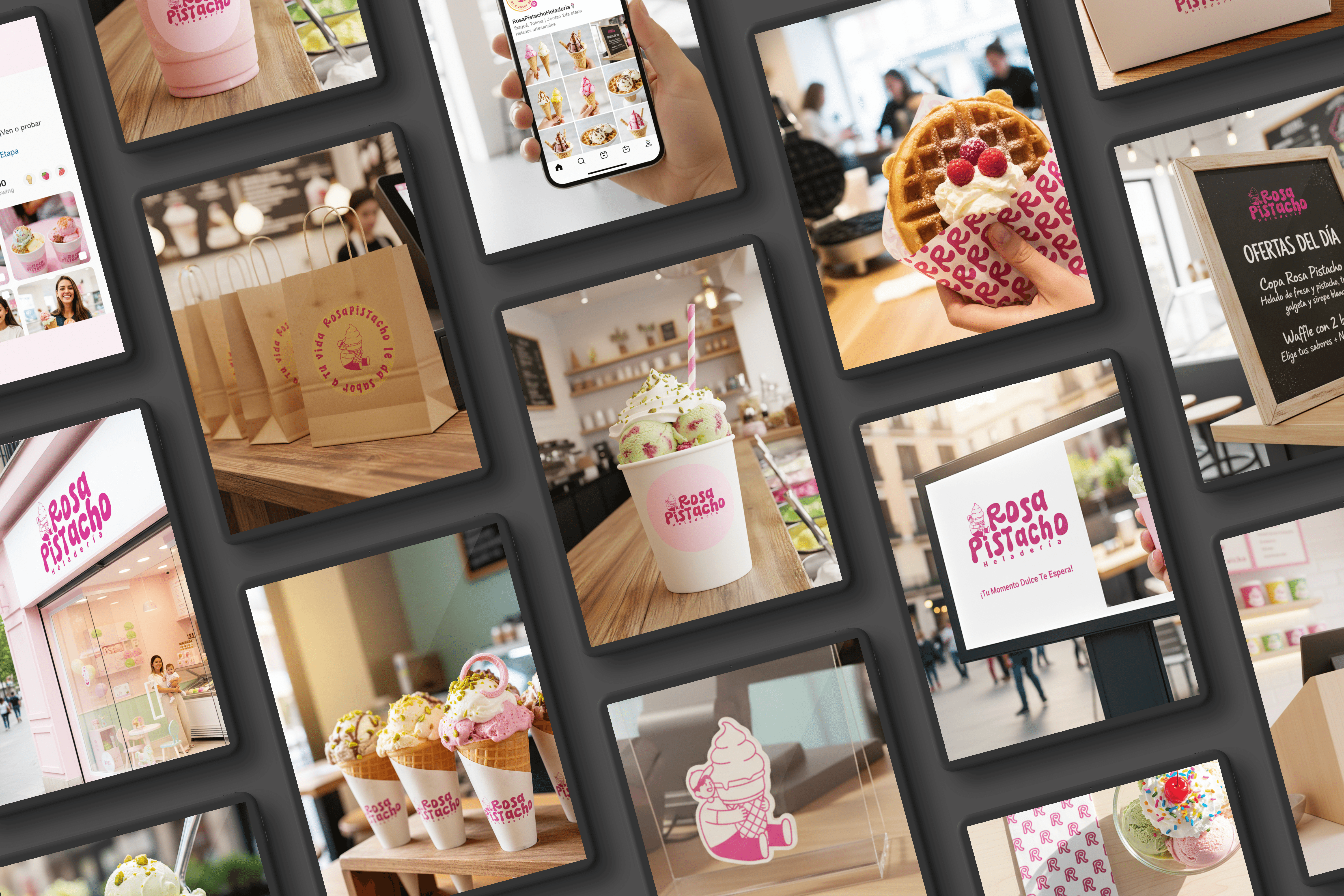
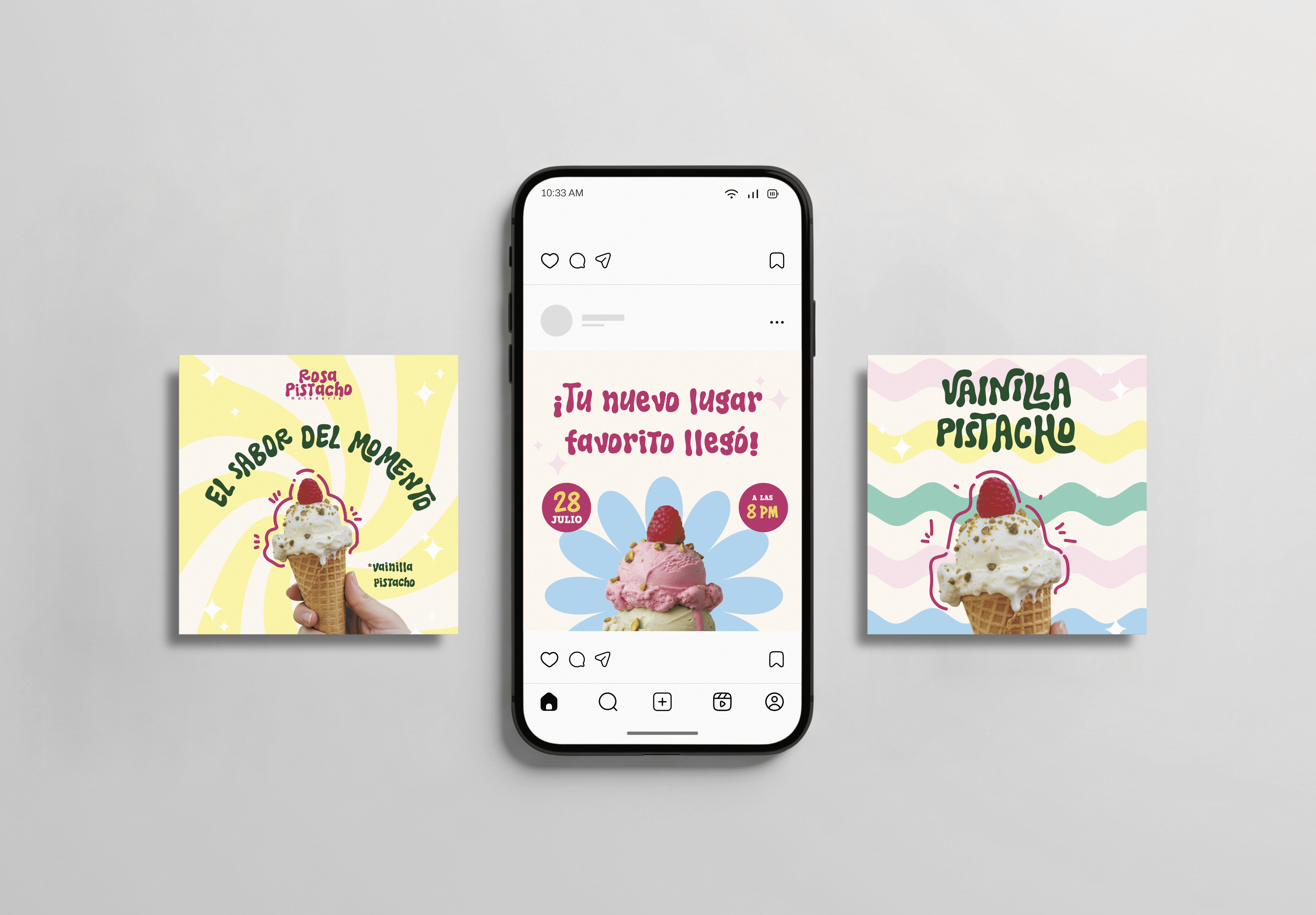
Brand applications — packaging (cups, kraft bags, cone wrappers), social media templates (posts and stories), stickers, brand patterns, and a full brandbook.
Tools used: Adobe Illustrator, Adobe Photoshop.
RESULTS
A brand ready to open its doors.
Rosa Pistacho launched with a complete, professional brand system — something most small businesses in the region don't have even after years in operation.
The deliverables included 10+ brand touchpoints across physical and digital formats, and a fully documented brandbook that allows the brand to grow consistently without a designer in the room. A visual identity strong enough to stand out in a competitive local market from day one.
How we think
At ALUNA labs, we believe a brand is more than a logo — it's a strategic asset. For Rosa Pistacho, we didn't just design visuals: we built a complete visual world.
Every color choice, every typographic decision, every illustrated character and brand pattern was designed to work together — across a cup, an Instagram post, and a kraft bag — telling the same story every time.
Because a brand that looks consistent everywhere isn't an accident. It's the result of a system built with intention.