From gut feeling to data-driven business decisions
The owner of a Colombian artisan bakery was running her entire operation from memory and Instagram DMs. We designed an admin dashboard that gave her real visibility into orders, production, and demand — built for a non-technical user with a very real business to manage.

CHALLENGE AND SOLUTION
From gut feeling to informed decisions.
El Hormiguero's owner, Liz, was managing everything alone — production planning, order tracking, demand estimation, and customer communication — all without a single tool that gave her an accurate picture of her business. Every week she decided what to bake based on intuition, memory, and informal notes. There was no historical data, no order overview, and no way to know if she was overproducing or leaving demand unmet.
The challenge wasn't just operational chaos. It was the invisible cost of running a growing business without the information to make good decisions.
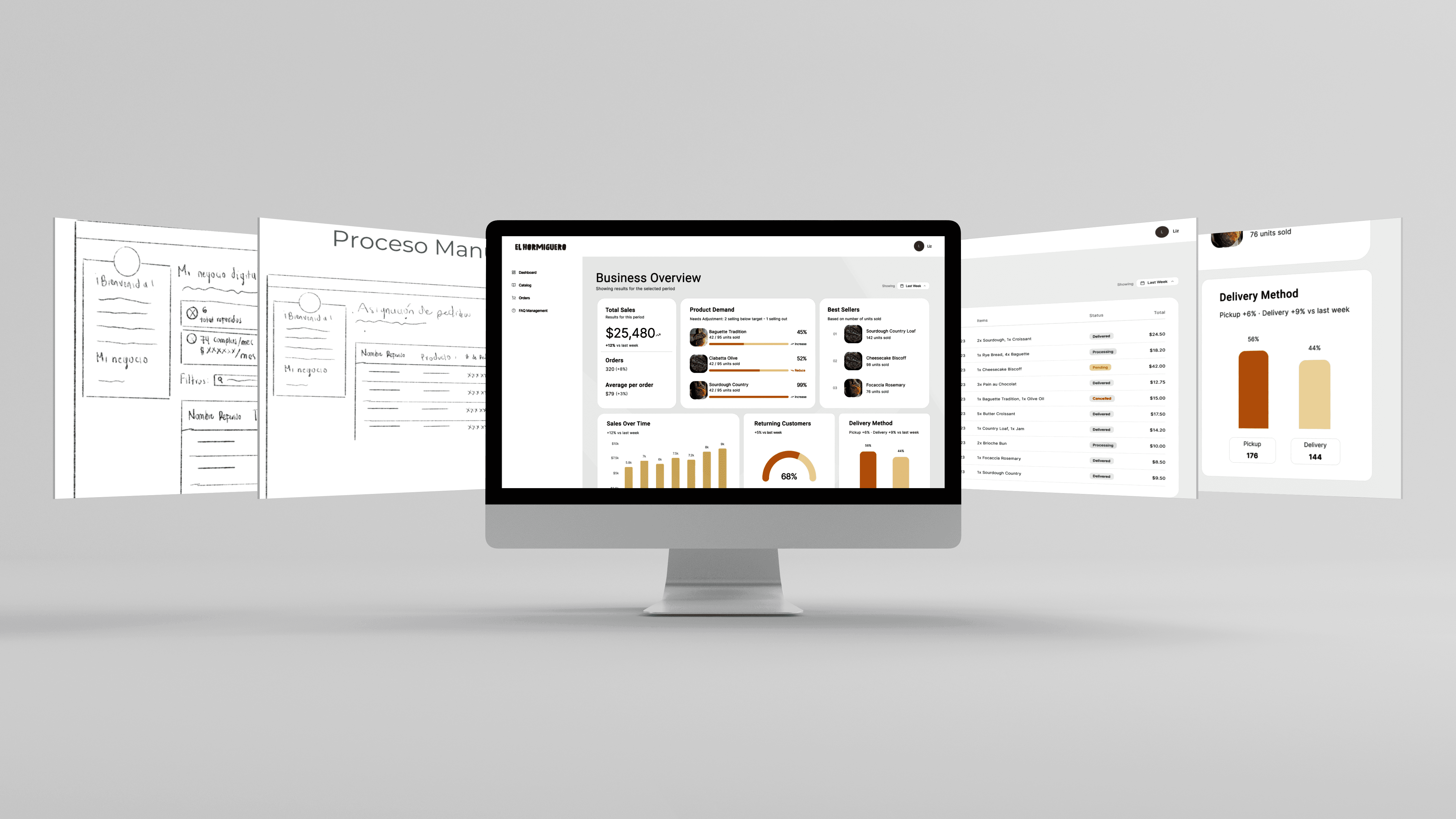
Our answer was an admin dashboard designed specifically for a non-technical small business owner. Not a complex analytics platform — a focused, clear tool that answered the questions she was actually asking every week: What sold? How much did we make? Are we growing? Should we bake more or less next week?
The dashboard consolidated order data, revenue trends, product performance, and fulfillment patterns into a single view — with a global time filter that let her compare any metric across the same time window, without having to cross-reference multiple sources.
METHODOLOGY AND TOOLS
Designed around a real user, not a generic admin.
The research phase included a stakeholder interview with the bakery owner and a detailed user journey mapping exercise that traced every step of her weekly operational flow — from production planning to order management to delivery. This revealed where time was being lost, where decisions were being made blindly, and where a dashboard could actually make a difference.
A key strategic decision was to design for comprehension, not data density. The owner's relationship with digital tools was visual and intuitive, not analytical. Every component had to communicate clearly at a glance, without requiring her to interpret charts or cross-reference numbers.
The dashboard was built around six core components:
Revenue card, with trend comparison and a sparkline to show movement over time
Orders card, tracking weekly volume and changes
Average order value, to understand purchasing behavior
Product performance, focused on units sold rather than revenue — because production planning depends on quantity, not just income
Demand vs. capacity alignment, to flag overproduction or unmet demand before it becomes a problem
Fulfillment breakdown, showing the pickup vs. delivery split and its operational implications
Tools used:
Figma, for UI design and interactive prototyping
Procreate, for early-stage sketching
Miro, for user journey mapping and information architecture
AI-assisted workflows, for proto-persona development and behavioral pattern synthesis
RESULTS
Clarity where there was none.
Usability testing focused on strategic comprehension — not aesthetics. Participants were asked to describe the state of the business, identify urgent problems, and explain what production decisions they would make based on what they saw. The dashboard passed: users could orient themselves quickly, interpret trends without guidance, and make confident decisions from the information presented.
The design delivered:
A single source of truth for weekly business performance, replacing scattered notes and memory-based decisions
A global time filter that created a cohesive mental model — all metrics in sync, no conflicting timeframes
Production-oriented data that spoke the owner's language: units, not just revenue
A demand vs. capacity view that no off-the-shelf tool was offering for a business at this scale
How we think.
At Aluna Labs, we don't start with screens — we start with questions. What's actually breaking? Who's being left out? What does the business need to function, not just look good?
With this dashboard, the answer was visibility. A business owner making every decision from memory deserves better tools — not enterprise software, but something designed around how she actually thinks and works.
That's what we do: take real operational complexity and turn it into experiences that feel effortless for the people using them.